

Secret of great room lighting is to use multiple light sources, creating interesting pools of light and shadow.
Read more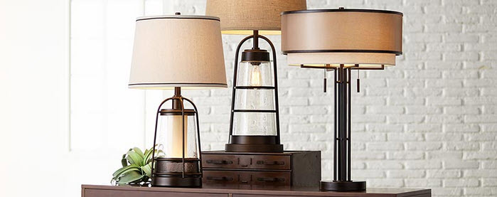
Here are some of the most common questions we get asked about table lamps at Lamps Plus! Where can I buy table lamps? Lamps Plus is the largest lighting retailer in the United States, and your one-stop-shop for all things…
Read more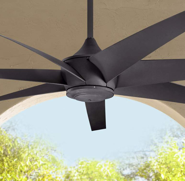
Ceiling fans are a great way to add air circulation and movement to your home, and they can be installed on any ...
Read more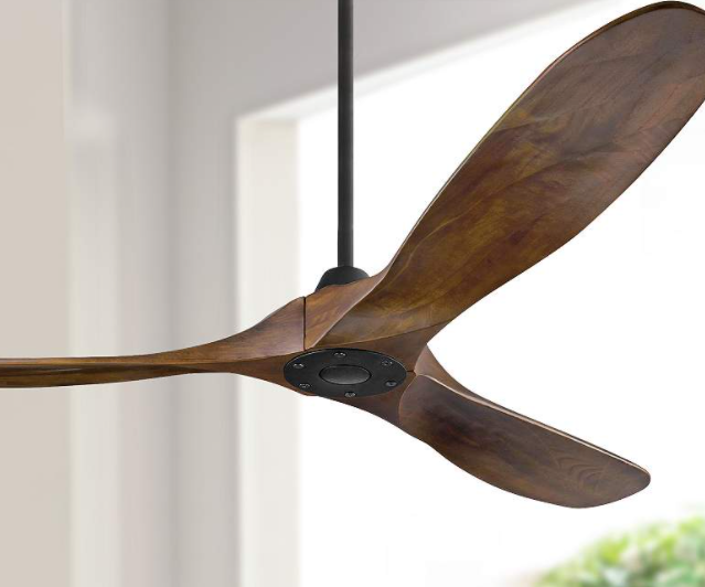
Ceiling fans are a great way to add comfortable air movement to any space both inside or outside your home. When everything ...
Read more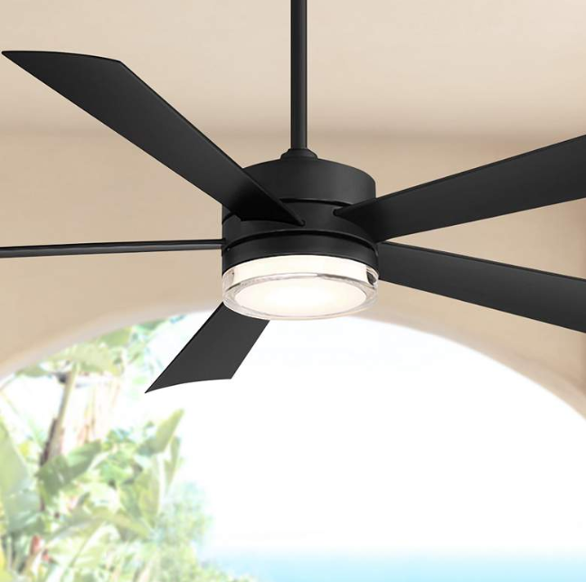
Dimmer switches are a great way to control your lighting and enjoy varying levels of brightness. They are a popular addition for ...
Read more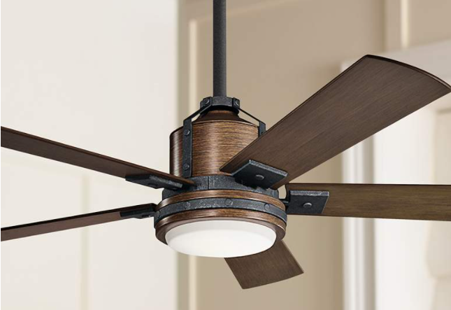
We are familiar with the frustration that accompanies technology no longer working when it functioned just fine the day before. As ceiling ...
Read more
Many ceiling fans now either come with a remote control, or are able to connect to a remote control. But what if ...
Read more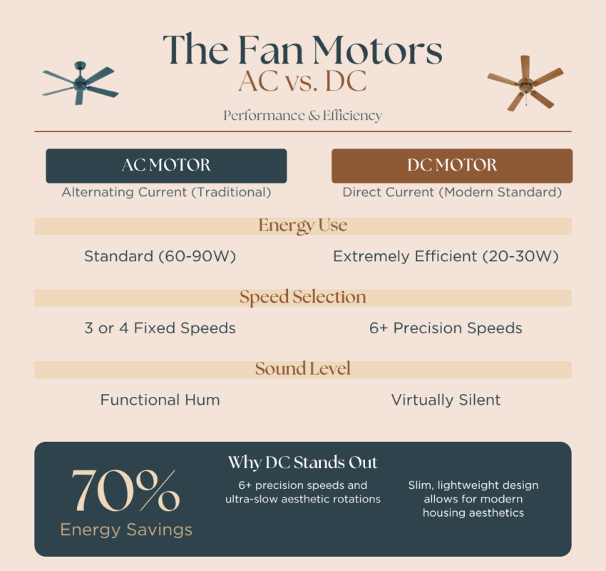
Every ceiling fan uses a built-in motor to power the fan and spin the blades, creating air movement. Not every motor is ...
Read more
SWEEPSTAKES ARE NOW CLOSED! Product Details 6 1/2″ high x 6″ wide x 3″ deep overall. Weighs 6 lbs. Built-in LED module. ...
Read more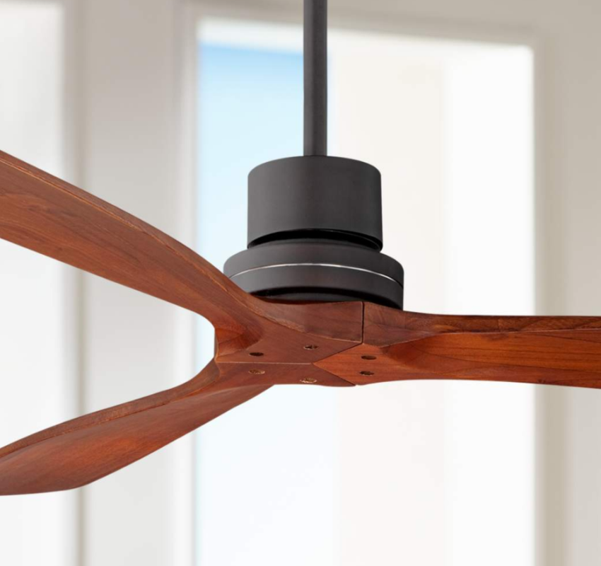
If choosing the right ceiling fan for your space seems overwhelming, here are 8 tips to help you make your decision. Quick ...
Read more
Your outdoor lighting improved. Use this guide to design a useful and beautiful outdoor lighting plan. ...
Read more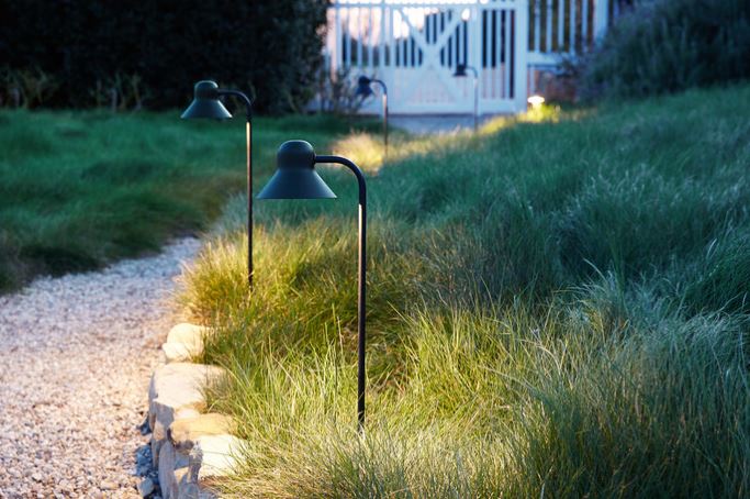
Everything you need to know to design and connect your own lighting system outside your home. ...
Read more